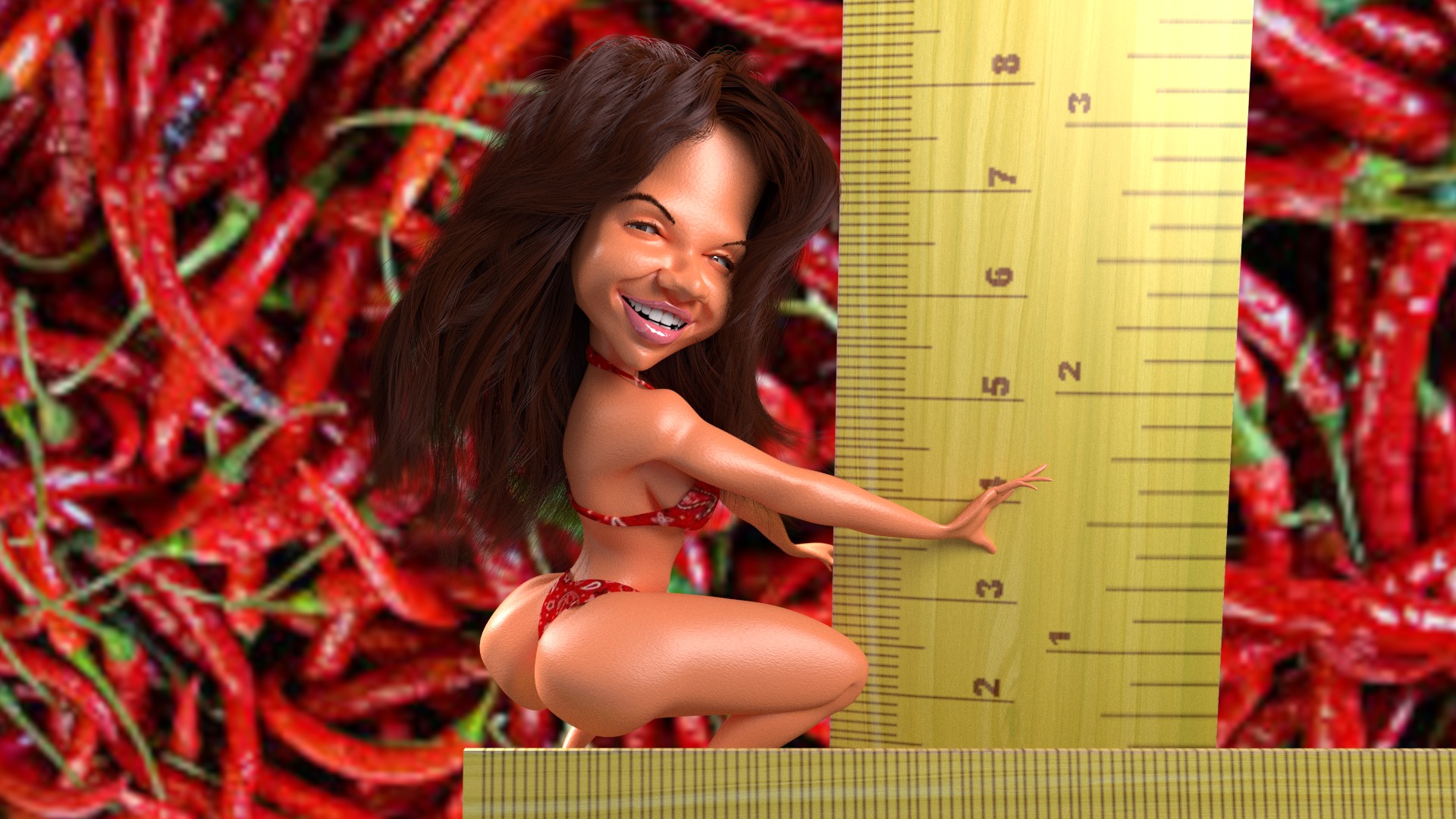
Of course, the hair needs to be shaped and groomed. The texture on the belt is missing, and I'm not sure why. The bracelets, jewelry and bow are off centered, but that's fine for now. The next step is to create the armature and then the actual posing. To be continued...
A rough rendered pose.
Most of the elements are in place...
Still tinkering.
Yeah, that's supposed to be jewelry. Not sure if that's working out. Either way, I need to start working on the cursed hair. I'll be back.
Warning! This is the remix! This is the remix!
In case this isn't obvious, I wasn't pleased with the results of my last caricature, so I'm remodeling it from scratch.
Today I start on recreating the jewelry and re-working the hair. I hate doing hair, but it has to be done, people.
Nice, but not perfect.
I like the look of the dress. The face is still an issue with me. I need to figure out how to clean it up before I consider it finished. And maybe the jewelry needs to look sharper as well. I'm not sure as to why it looks so muddy. (And for the record, this one picture took nine hours to process on my laptop. I don't know why, but it did.)
And for my next trick...
So, I've spent the past week working on a new Marilyn Monroe caricature. This was the initial model I created.
At this point, I started to remodel the hair, add jewelry and correct the face.
So, once I decided on a pose, I reworked the hair but wasn't pleased with the dress. Today, I remodeled the dress from scratch.
Here, I constructed the big fat bow in the back, added texture to the dress and stretched out the face. I'm currently processing the finished version. It should be done in a couple of hours. (If you noticed, the right earring is inexplicably floating in her hair with the left earring completely missing. That is one issue I needed to correct.)
Lighting and camera work is tricky.
I've been spending these last couple of week re-rendering my digital caricatures based on what I'm slowly learning about lighting a scene properly.
In this first image, I used that highly touted three point lighting system that photographers are supposed to use. The problem is that the lights were located haphazardly with no regard to shadows and highlights. Could've been done better.
The second image positioned the lights at a 45 degree angle from the subject. One light source was even situated to place highlights in each pupil, which the first picture didn't have. It's a little darker in tone, but I think more lifelike.
