Creating a 3D model based on a real live human being can be hard. Hard, I say...
I was having trouble getting the mustache to render properly. Grrr...
Still not looking the way I would like, but it's close. Maybe even close enough.
Creating a 3D model based on a real live human being can be hard. Hard, I say...


I was having trouble getting the mustache to render properly. Grrr...

Still not looking the way I would like, but it's close. Maybe even close enough.

1) It's very rare that I purchase a print of artwork from anybody, let alone post a shot of it on my website. However I am trying to find ways to show some support to those struggling in the field of fine arts. ( The internet may be part of the problem, that's a whole other conversation. )
2) Can my nails be any longer? Seriously, I'm not tall enough to have these crazy narrow Arsenio Hall-like fingers, am I? It's just weird. Okay, I'm done.

So my little experiment is finished. Although the image is way too grainy for my taste, I'm rather pleased with the results. Perhaps, I'll pic another clip to re-do starting tomorrow.
So, there is this 3 1/2 minute video that I animated and posted on YouTube last year. I named it My O7 Project. Since posting it, I've learned a few new tricks, became aware of a few new techniques and now I'm curious about how they would apply to that year old video. Here is the 14 second clip that I'm focusing on, today.
The woman dancing was supposed to be a caricature of Janet Jackson. It's close, but not a very good job. The face wasn't done well at all. The fingers are stiff. Her hair is the wrong shape. Wrong, wrong, wrong. The man at the keyboard was supposed to be music producer Jimmy Jam Harris. Again, I should have done better.
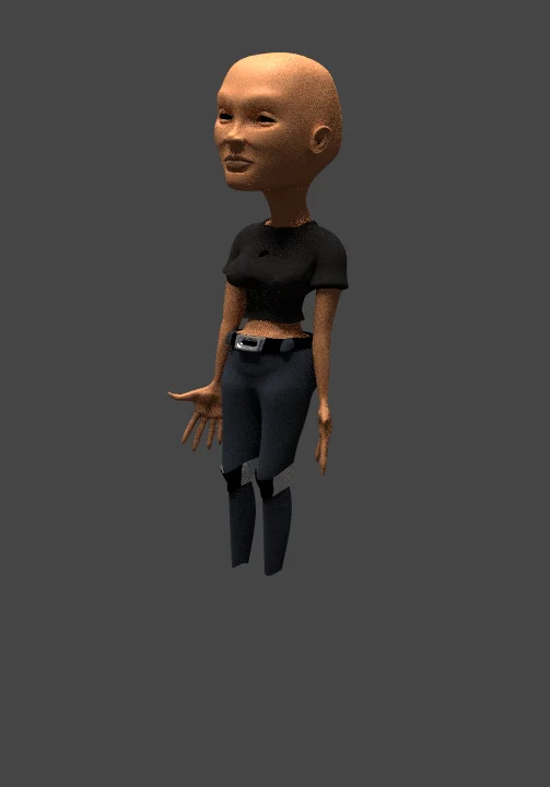
So, here's the plan. First; use a more refined armature underlying each character. This armature will control the fingers as well as the facial movements if necessary.

Second; rebuild each character to make each one a little more life-like. That includes the faces, the textures and the clothing.


Third; rework the poses and choreography. Although I like what I did in the first video, after looking over the original Janet Jackson video of which these moves were based on, I now believe I can work this better than that first animation.

Oh, did I mention that I already started the process? Here's how it looks thus far with only the Janet character.
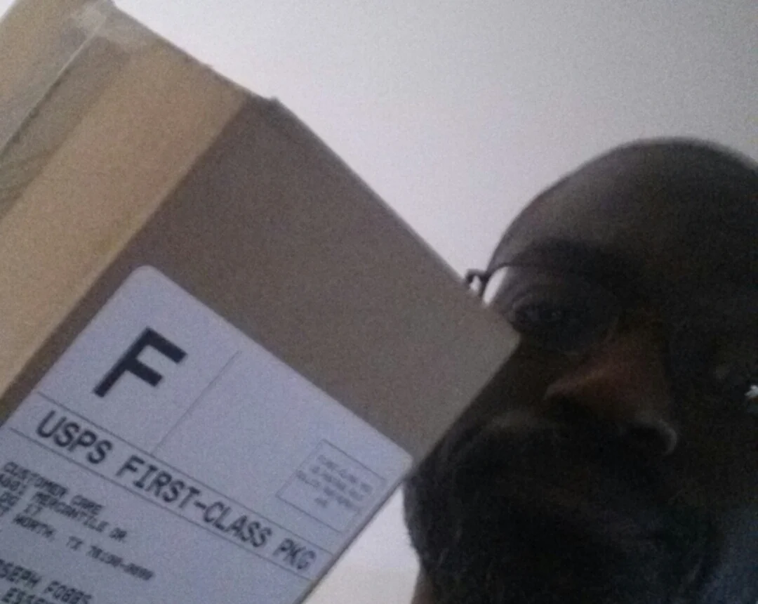
Why do they constantly leave my packages slumped beside our dusty old garbage can in front of the basement door? No one lives in the basement! I may sound like a grouch, but Oscar's name does not appear anywhere on these packages. If they have trouble getting someone to answer, U.P.S. will actually leave the package with a next door neighbor. The Post Office, however, leaves it on top of the garbage. Classy. I'm finding it hard to believe that there's only one lowly mail carrier who's been treating all my deliveries like common rubbish. But this has been happening for years, now. Do they all need in-service training to help decipher the difference between a mail box, a mail slot and a garbage can? Ugh.
Okay, I'm done.

Yesterday, I was reminded of a drawing class I took back in the early 80's. Now, this was an art school, so all the students were talented in their own right. But the teacher was particularly stingy with his grading. His favorite line for all his students was, " This could be a good piece... ". And then not really explain why it isn't a good piece.
He assigned a project which seemed easy enough at the beginning, but in the end proved very difficult for obtaining a high score. The project was to draw a life sized self-portrait. Again, everyone in the class knew how to draw and he gave us several weeks to accomplish this. Piece of cake, right? Everyone purchased their extra large paper and went to work. Most (if not all) of the students were very hyped about the potential results, including myself. I drew myself in Prismacolor, wearing my little beige windbreaker, which I'm sure everyone recognized at the time. It took me many, many hours of looking in the mirror to get that drawing exactly right. On the day this project was due, all the students proudly showed off what they accomplished to our grade miser. I can't recall, but I believe that particular piece earned me a C+. Sigh. My personal favorite drawing was done by a girl named Lisa. Lisa almost went down the cheesy route by drawing herself in black and white looking in a mirror. However, her reflection was wearing this well thought out, intricately rendered dress from the Victorian age. Brilliant. Because this was 30 years ago, I'm a little shaky on what she was graded, but I believe she earned a B+.
What I do remember is the one person who received an A. I won't say his name because I never really knew this guy, but his idea of a life size self portrait was to draw three or four squiggly lines running down the center of the paper. And that's it. Done. Yes people, that earned him an A. People were talking about that guy for days.
I recently Googled his name (which I still shall maintain as nameless) and apparently he's become some hotshot media design, animation guy... pretty much everything I WISH I was. So, what's the moral to this story? Who knows. But if you want to comment on my little anecdote, just draw a few of squiggly lines in the comment box below. I'll grade it, later. Thanks.
This is the first day of the new website. I got nothing else.
